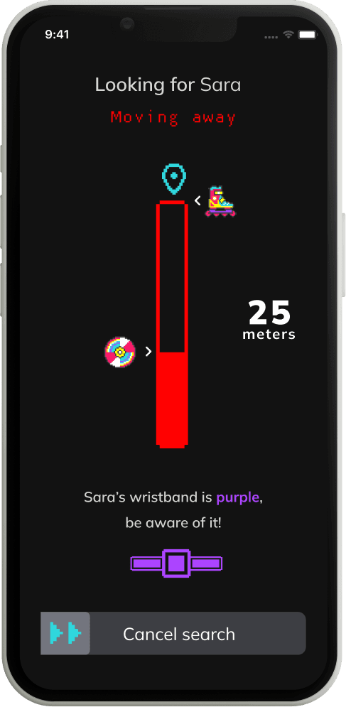
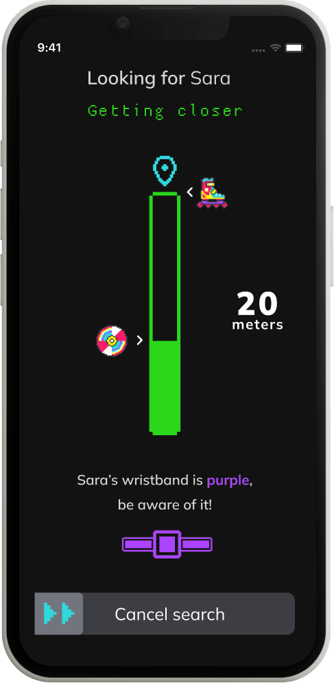
Challenge
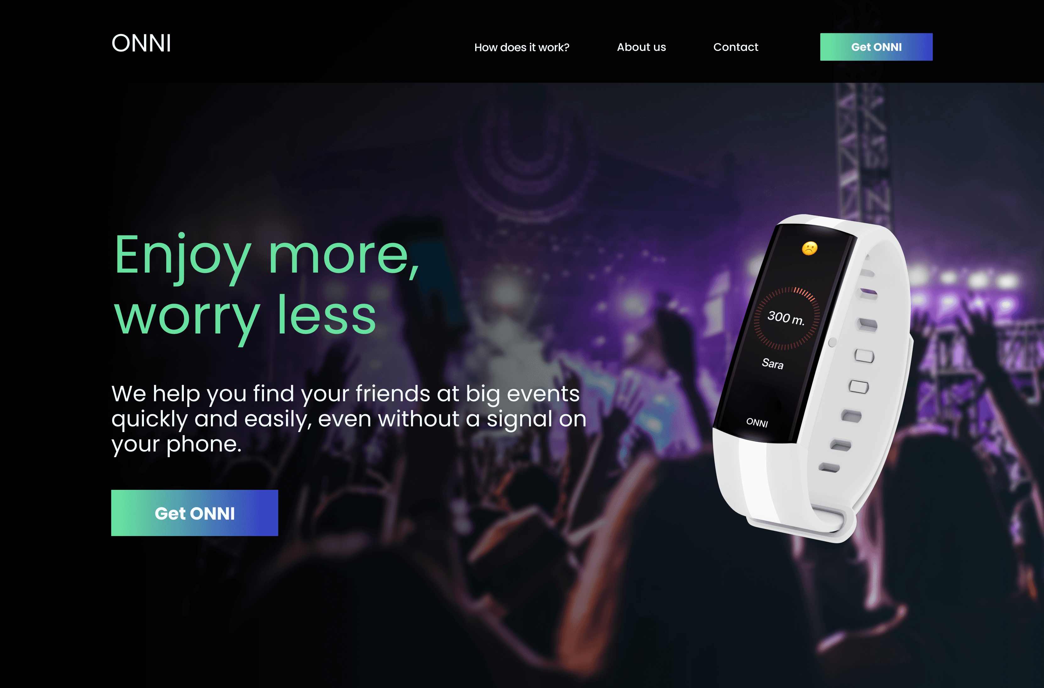
Some people lose their friends at big events making them feel worried about finding them instead of living the experience.
Additionally, there is a huge technical limitation:
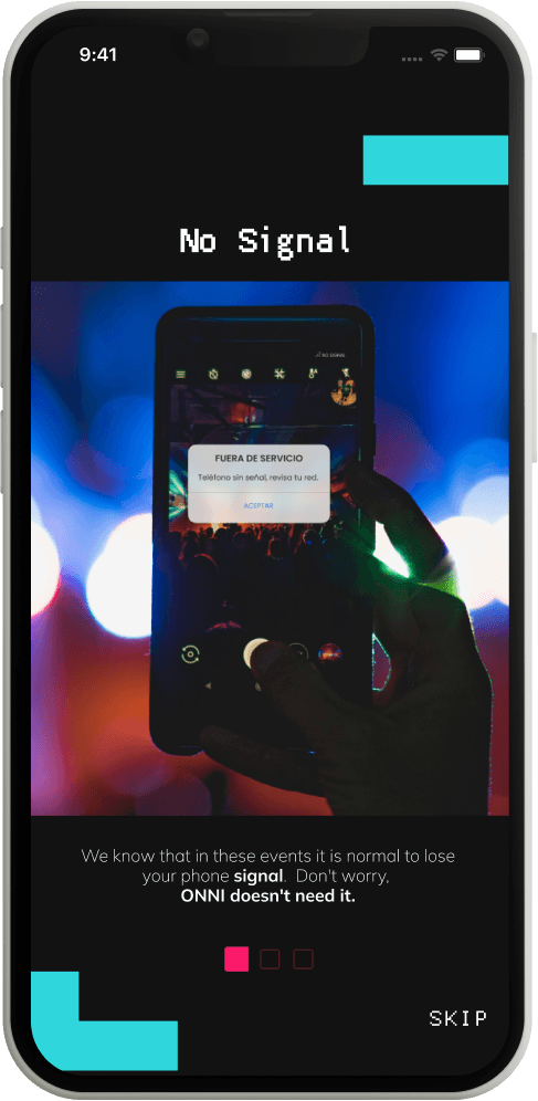
Smartphones usually lose internet and signal in these events.
Solution
To offer a service that helps people to meet again at big events quickly and easily.
Onni is not signal or internet dependent and is affordable.
It syncs with the users' smartphones and helps them find their friends, so they can focus on enjoying the experience.
Role
UX/UI Designer
Team
2 UX/UI Designers, 1 UX Researcher
This is how it works
How can we make it possible?
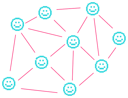
The process
Onni is a project that we designed from scratch, we used the Design Thinking methodology as it allowed us to prioritize the user's needs and iterate when it was necessary, all of this by working collaboratively.

Empathize
To begin with, we used some research tools as benchmark, surveys, customer journey map, and user interviews to get more context about concert and festival attendees and their pains.
We found out that currently, the only way for people to find their friends when they lose them is by call or via WhatsApp, but this has serious issues:
There is no stable coverage or internet signal in these events. It's terribly unstable and most of the time you don’t have any of them.
Even if they manage to communicate with their friends, they still have problems finding them because there are too many people and few reference points to use.
We did market research where we found interesting data to have into account.
Here are some metrics about the attendees:

Define
With all the information gathered in the research, we did a user persona with the highlights of our user. Say hi to Brenda!
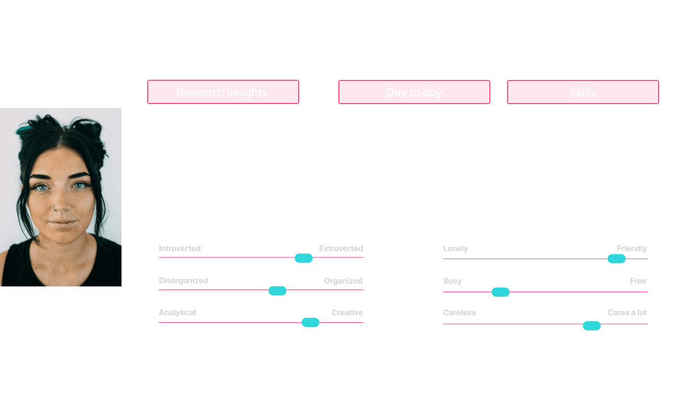
Based on our user persona and empathy map, we asked ourselves some questions and converted them into How Might We:
HMW help them go for a drink or to the bathroom without fear of losing their group?
HMW make users forget their worries and enjoy themselves to the fullest?
HMW help people to find their friends when they get lost in the crowd?
HMW better guide/inform the attendees of mass events?

Ideate
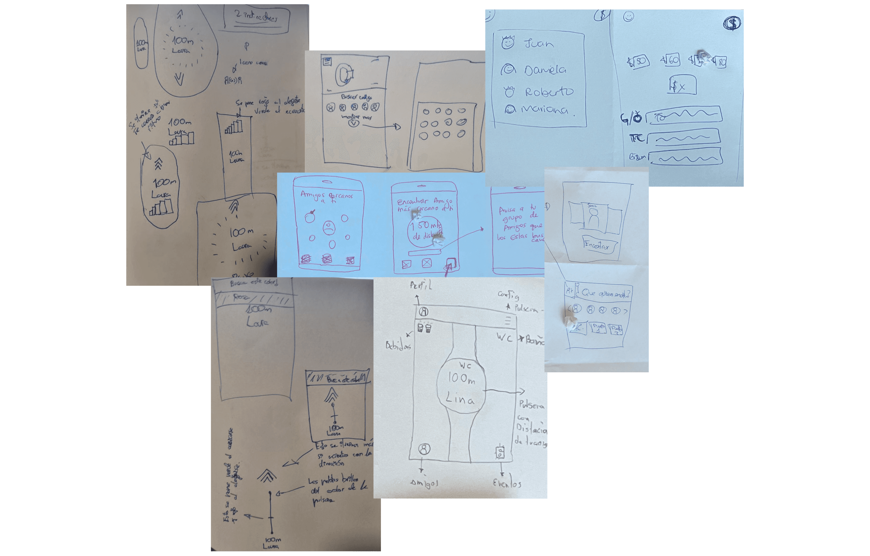
We knew what we had to solve, so we brainstormed with our big ideas followed by a prioritization matrix in order to choose the best solution and work on it. That is how the idea of Onni came about.
Is Onni a safe service?
We understand that having a device that lets other people track you has its risks.
So how can we be sure that malicious people don't make bad use of our service? Well, we have 4 things that make Onni really safe:
Adding a friend requires actions from both sides.
The tracking just works with added friends, also, they can delete friends at any time.
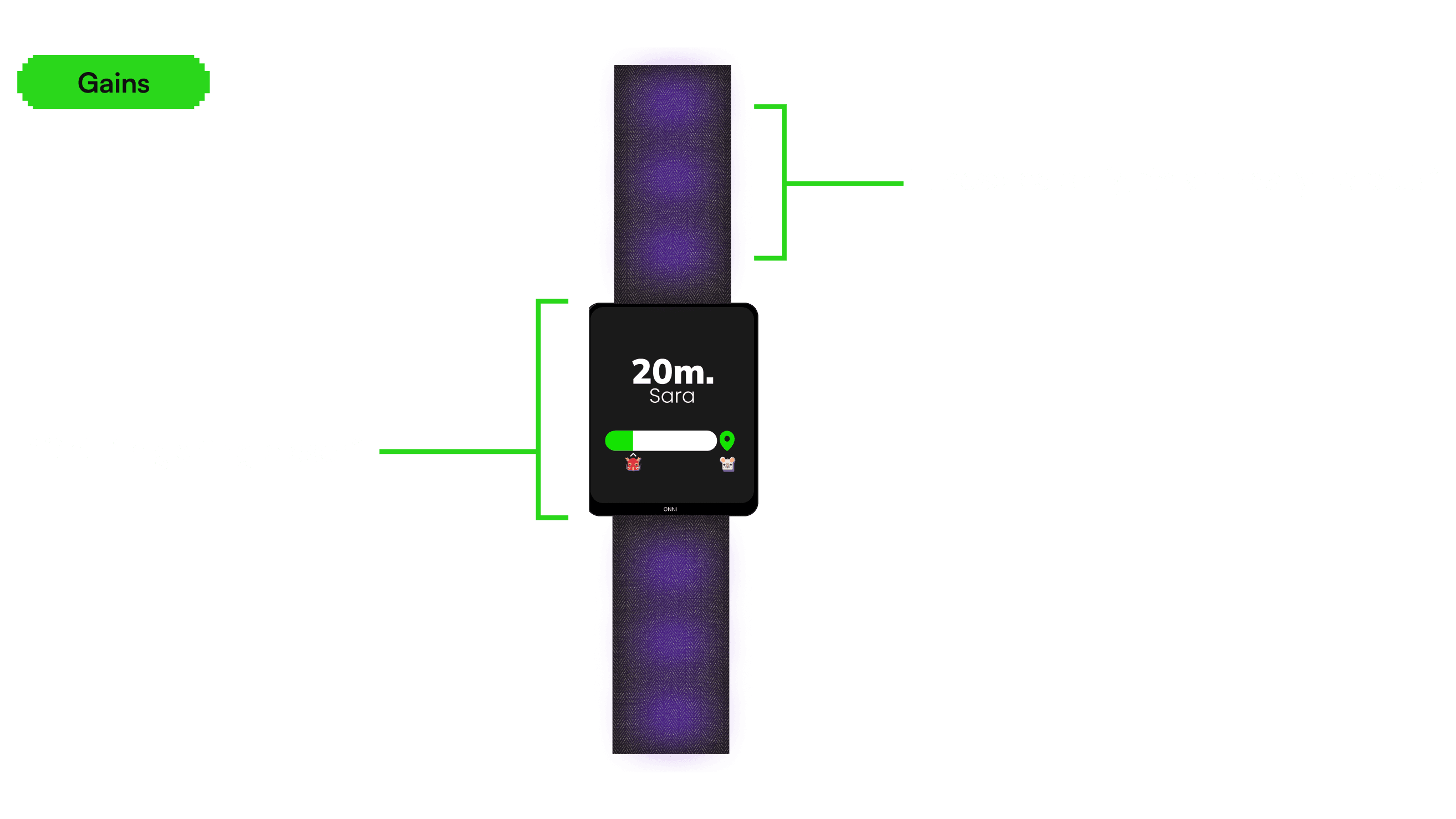
The only physical button that the wristband has is meant to stop the tracking. The wristband also vibrates and gets illuminated in a dark environment, so it is really clear for the users to notice when someone is looking for them.
Due to technology limitations, Onni doesn't work outside events, which is actually an advantage in terms of security and privacy.
But… what about business?
How can Onni be so affordable?
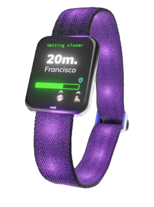
Onni has fabric bands with RGB LEDs which make it resistant and durable.
The buckle is made of plastic, adjustable to all wrist sizes.
Inside the wristband, there is a cheap wifi and memory controller attached to a small battery.
They have a low-cost display with a black backscreen, so you can see it better in a dark environment and save battery.
To validate our hypothesis, we used a simple Landing Page as a Proof Of Concept and managed to get our first early adopters. By interviewing them, we were able to confirm our first thoughts, get honest feedback, and iterate them.

Prototype
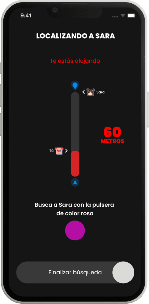
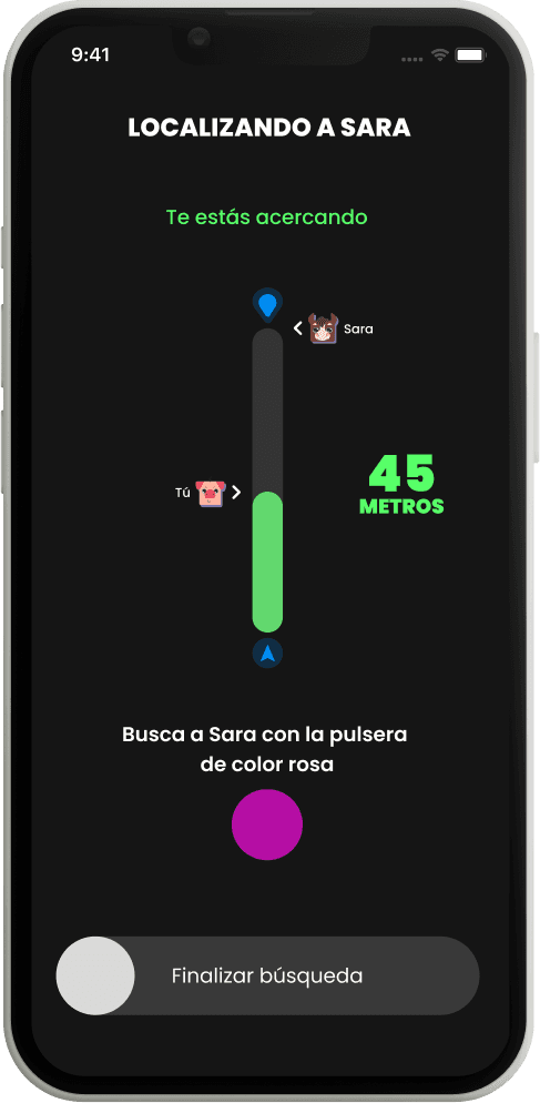
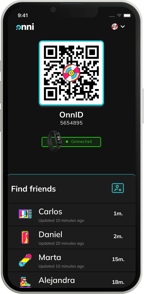
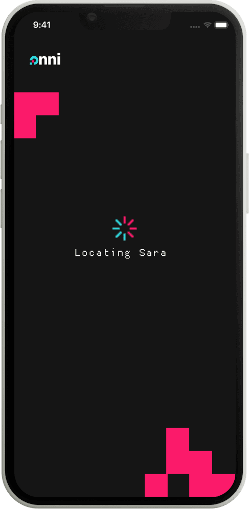
Find a friend. Choose a friend to find so the wristband will guide the user to them.
Log in. They need a unique ID to be able to identify their friends, Also, the company has to be able to track who already has a wristband assigned.
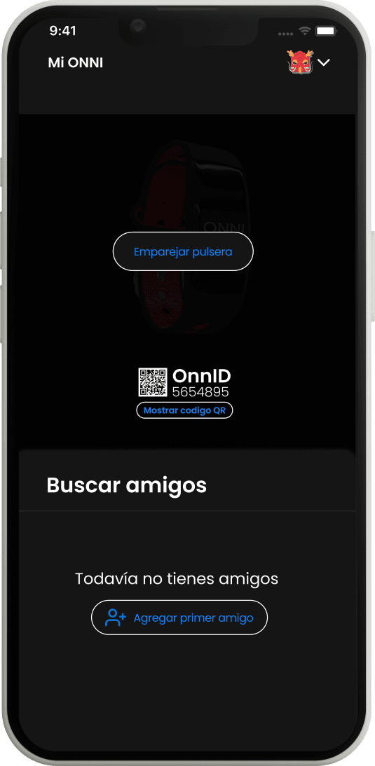
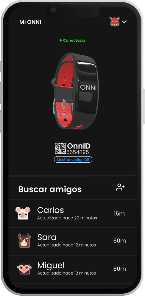
Wristband pairing. So the users can use their smartphone to control the wristband.
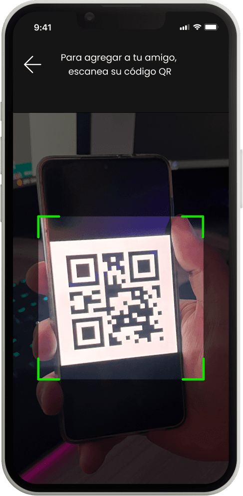
Add friends in 3 different ways:
- By direct message link so they add friends before the event.
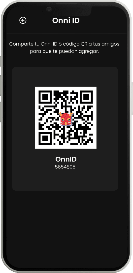
- By QR so they can easily add friends during the event.
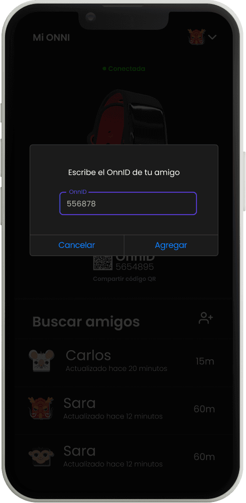
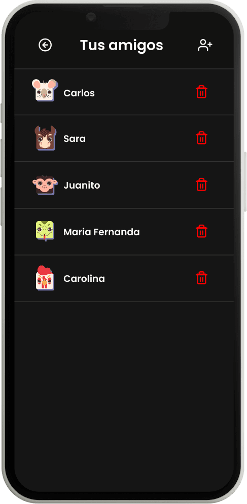
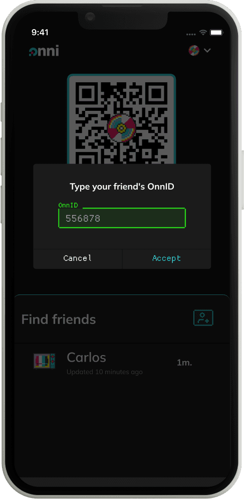
- By OnnID so they can add friends without depending on their camera.Delete friends. Essential in case they want their privacy.
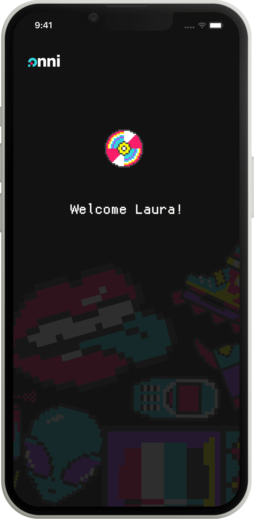
Onboarding. To show the user a short explanation of what they can do with Onni.
Change name. For letting their friends recognize them in their favorite way.
First-sight recognition. Each person will be recognized with a different avatar.

Iterate
It's time to do user tests to validate our product!
We interviewed 22 early adopters and designed for them the following tasks:
Go through the onboarding, log in, and reach the home screen.
Pair the wristband.
Add 3 different friends in different ways.
Delete a friend.
Change your name.
Look for your friend Sara.
Our research job seemed to be well-focused as we got great feedback in the first user tests, but still, there is always room to improve!
It took us 3 iteration cycles to reach the point where the users did every task without problems.
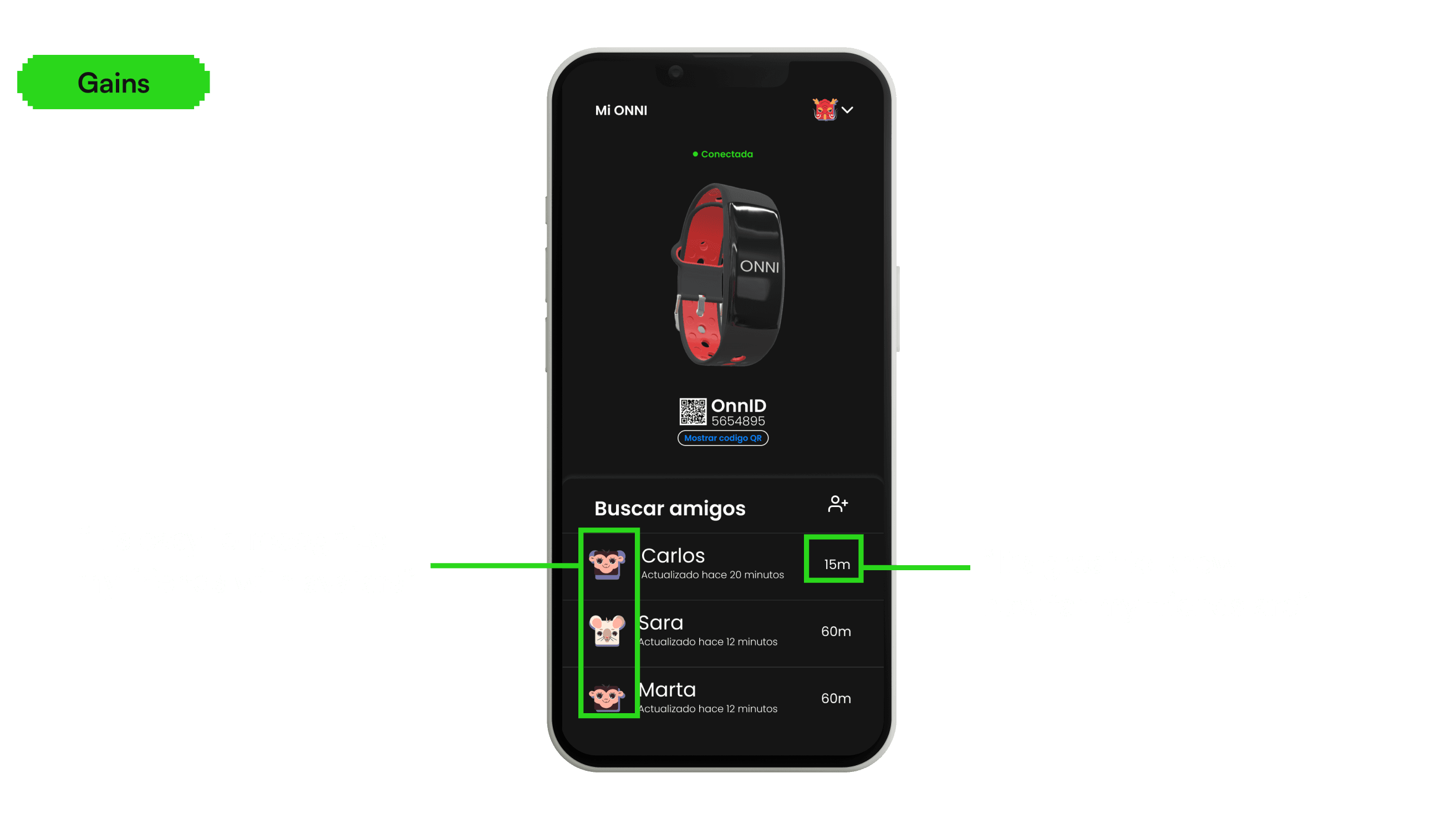
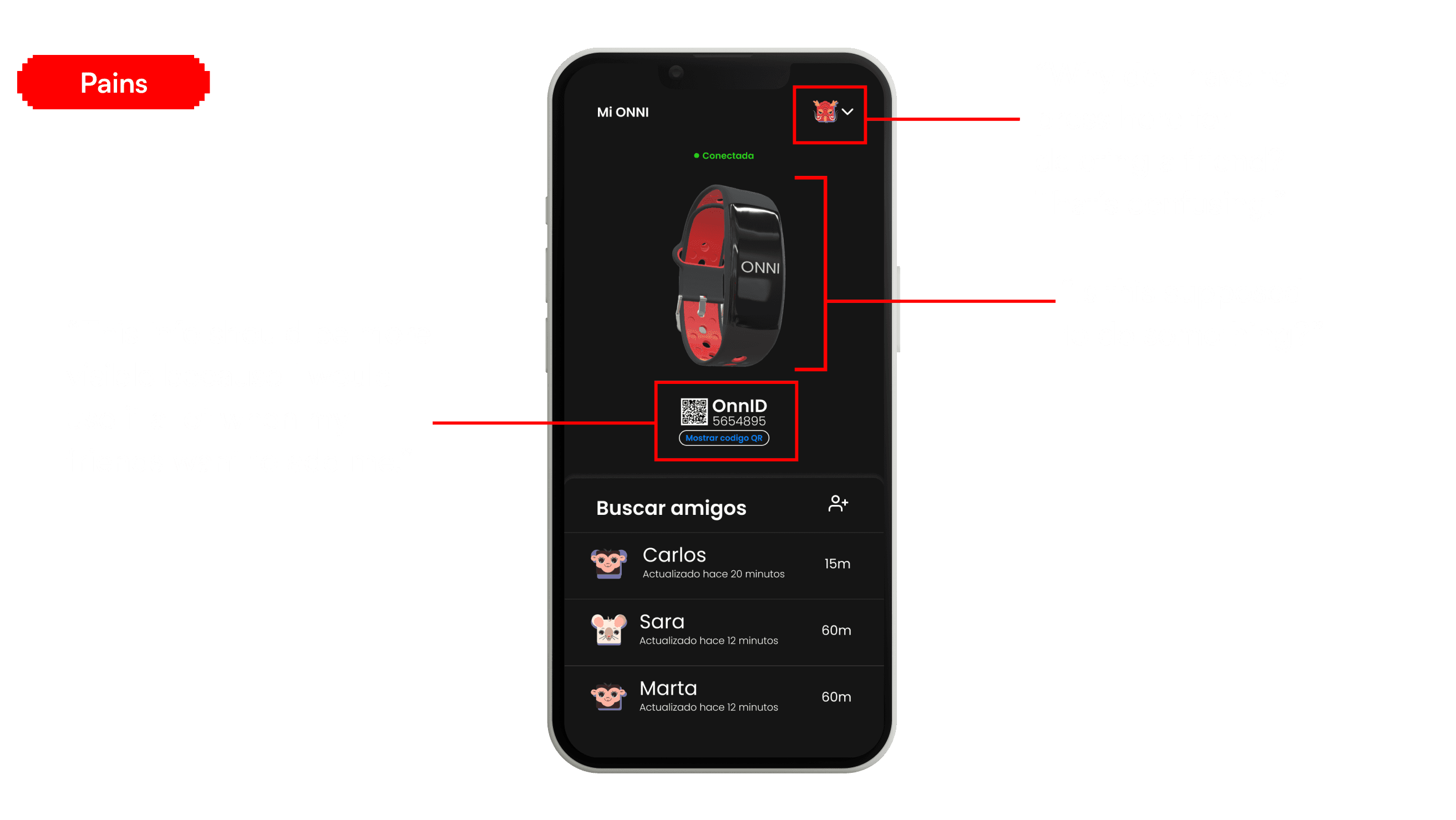
Here are some of the pains and gains quoted during the user tests we did.
Improving the UX
Taking into account the user's feedback during the validation, we implemented changes to enhance their experience. Here are some of the exciting changes we've made, including a sneak peek at the upcoming UI improvements that I'll dive into shortly for a closer look.
For deleting a friend, the user just needs to swipe left, instead of going to the menu and manage all from there, which was not intuitive.

UI Design
Since we created this project from scratch, we designed the Branding and the UI Design.
For this, we took into account 2 key points:
The users' age. Our main target includes millennials and Gen Z (ages 18-39). To bridge both generations and create a universally appealing brand, we decided to use pixel art, which is nostalgic for millennials (Pac-Man) and iconic for Gen Z (Minecraft).
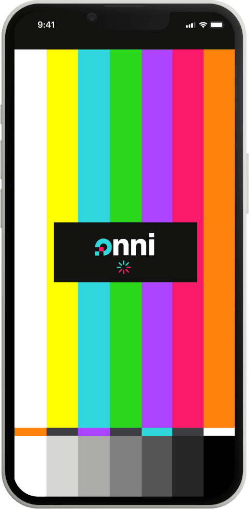
Unique Value Proposal. At the heart of our branding is a fundamental promise: the ability to connect with your friends even when you have no signal. To convey this essence, we recurred to the iconic "No Signal" message that once invaded every TV screen in the 90s.
This fusion of pixel art and the vibrant, saturated colors of "No Signal" forms the visual essence of Onni.

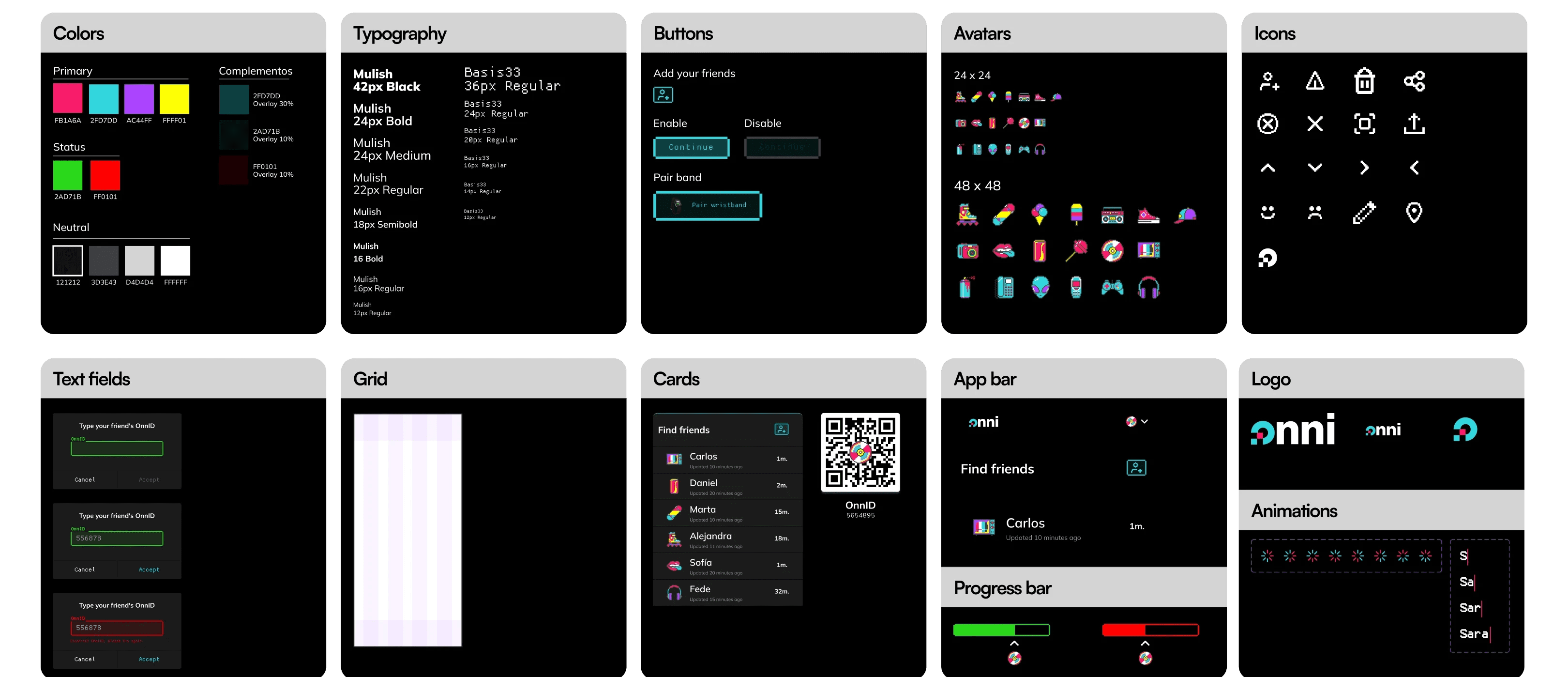
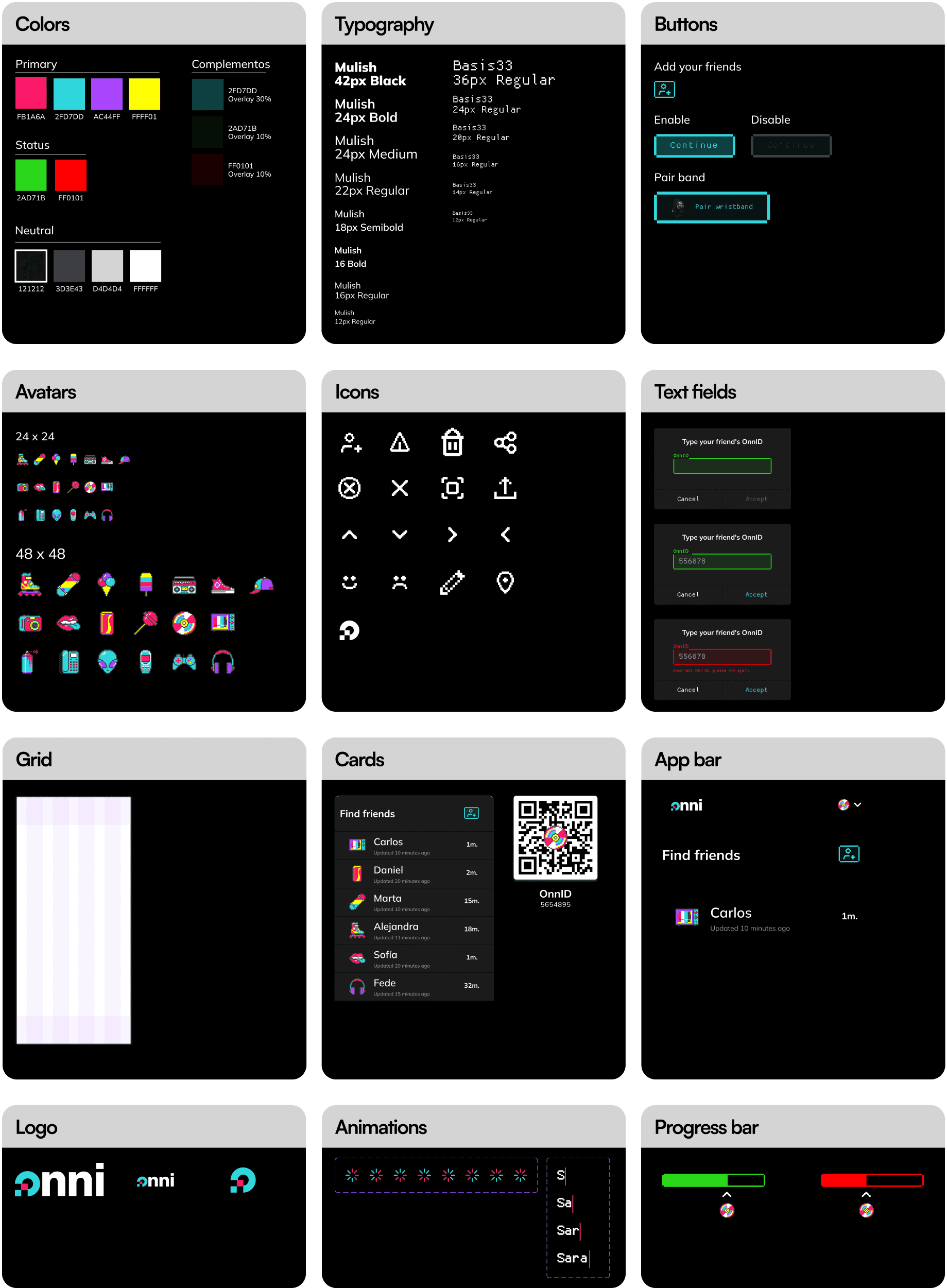
We chose Mulish as our main font to make texts easier to read and also to make a difference with all the square-ish styles of pixel art. For keeping the pixel touch, we chose basis33 font as complementary.
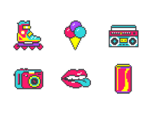
The icons and avatars we chose are pixel art, we kept in mind that they were recognizable for our users and that they had the 90’s vibes we wanted to transmit.

Saturated and powerful colors are part of our brand image. We took into account that the events where our users interact with Onni usually take place at night. Therefore, a light interface might be too intense for that situation, so we made it dark mode.

For giving a more contemporary style, we chose gifs as part of our communication tone.
Design System
Final result
Learnings
Here are some highlights of the things that I learned working in this project:
Attention to detail in the customer journey makes the difference. During our research, we found that most of the events happen in low-light conditions. Therefore, implementing a dark mode was essential not only for reducing eye strain but also for conserving users' battery life. Analyzing the context in depth enhances the user experience.
Scope and prioritize. Instead of loading up on features, aim for quality over quantity. Define what you want to build, why, and prioritize the most valuable features for your users. You can always add more features in the future.
Embrace fearless experimentation. When you are innovating, the uncertainty can stop you from doing great things. Push forward and trust in the iterative process, where you will get valuable feedback.
Use POCs to reduce uncertainty. If you're unsure whether an idea will work, invest a day in creating a quick mock-up and testing it with a small group. The wealth of insights and context you'll gain is incredibly valuable.
Expand horizons. Taking into account an external physical device that works with Onni app was a game-changer. It makes the correct creation of a user journey extremely important to understand which problems can our users face and in which situation.
Future
During the design process of Onni, we identified valuable functionalities that are worth implementing in the future, such as:
Virtual entrance: Currently, it's usual to have the entrance ticket as a QR on the mobile, Upon arrival at the festival, this QR code is exchanged for a wristband to simplify access for the days ahead. Adding this function to the Onni wristband it's a convenient option.
Cashless: In response to the growing trend of cashless transactions at festivals (representing 54% of payments), we plan to introduce a cashless payment system within Onni. This feature will enable users to make secure payments for drinks and food using their Onni wristband.
Find places: Our interviewees suggested that they often struggle to locate essential facilities like bathrooms, food trucks, or their own tents. Extending our technology to help them easily find nearby places of interest would solve another problem for them.
Thanks for reading! I hope you found my design and thought process engaging and enjoyable. :)

